Getting started with croquis
Creating a graph involves the following three steps:
Create a figure object:
fig = croquis.plot(...)Add one or more lines:
fig.add(x, y, ...)Generate the figure:
fig.show()
Step 2 can be repeated as many times as you want: the first two arguments must always be X and Y coordinates; the rest are options. Now let’s see some examples.
Adding multiple lines, one by one
Please paste into a Jupyter cell:
import croquis
import numpy as np

fig = croquis.plot()

for fn in np.sin, np.cos, np.tanh:
    X = np.linspace(-5, 5, 100)
    Y = fn(X)
    fig.add(X, Y, label=fn.__name__)

fig.show()
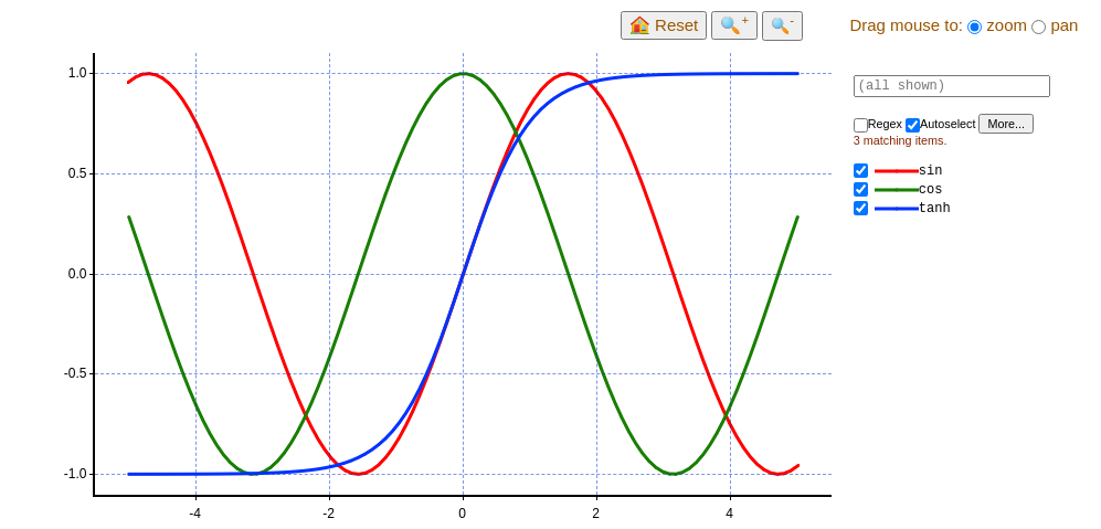
The size of the graph will automatically adjust to match the browser window. (Sorry, currently there’s no option to manually modify graph dimension.)
Adding multiple lines at once
While the previous code works, it’s not the most efficient way to handle large data. If your data is already in a rectangular block, you can add them at once:
fig = croquis.plot()

X = np.linspace(0, 2 * np.pi, 200)
freqs = np.linspace(0, 1, 100).reshape(100, 1)
Y = np.sin(freqs * X)  # matrix of size 100 x 200
fig.add(X, Y, labels=['freq=%.2f' % f for f in freqs])

fig.show()
This will show 100 pieces of sine waves, each with a different frequency.
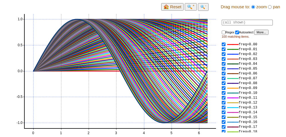
Here, labels is optional: if you omit it, then croquis will give each line a
boring, unimaginative name such as “Line #0”, “Line #1”, etc. If you do specify
labels, it must be a list of strings (or something that can be converted to
it), and its length must equal the number of lines you’re adding.
(Astute readers may notice that the first example used label while the
second used labels: label is just a shorthand when you are adding
exactly one line.)
Adding multiple lines with different X, Y coordinates
In the previous example, the same x coordinate is shared by all lines. (Readers familiar with the concept of NumPy’s broadcasting may notice similarity.) However, of course, that’s not necessary:
fig = croquis.plot()

Theta = np.linspace(0, 2 * np.pi, 200)
Cx = np.random.normal(size=100)
Cy = np.random.normal(size=100)
R = np.random.uniform(low=0.1, high=2.5, size=100)

# Here, X and Y are 100x200 matrices - each row contains 200 points that
# comprise a circle.
X = Cx.reshape(100, 1) + R.reshape(100, 1) * np.cos(Theta)
Y = Cy.reshape(100, 1) + R.reshape(100, 1) * np.sin(Theta)

# (Optional) having some fun with colors:
#      green
#        ^
# blue <-+-> red
# (Smaller circles are darker.)
colors = np.zeros((100, 3))
colors[:, 0] = (Cx * 0.2 + 0.5).clip(0.0, 1.0)
colors[:, 2] = 1.0 - colors[:, 0]
colors[:, 1] = (Cy * 0.2 + 0.5).clip(0.0, 1.0)
colors *= R.reshape(100, 1) / 2.5

fig.add(X, Y, colors,
        labels=['c=(%.2f, %.2f) r=%.2f' % x for x in zip(Cx, Cy, R)])

fig.show()
Here we also specified colors: if given, it must be a matrix of shape (N,
3), where N is the number of lines. Each row is the RGB value for the
line. If it is an integer type, the range is [0, 255]; for floats, the
range is [0.0, 1.0].
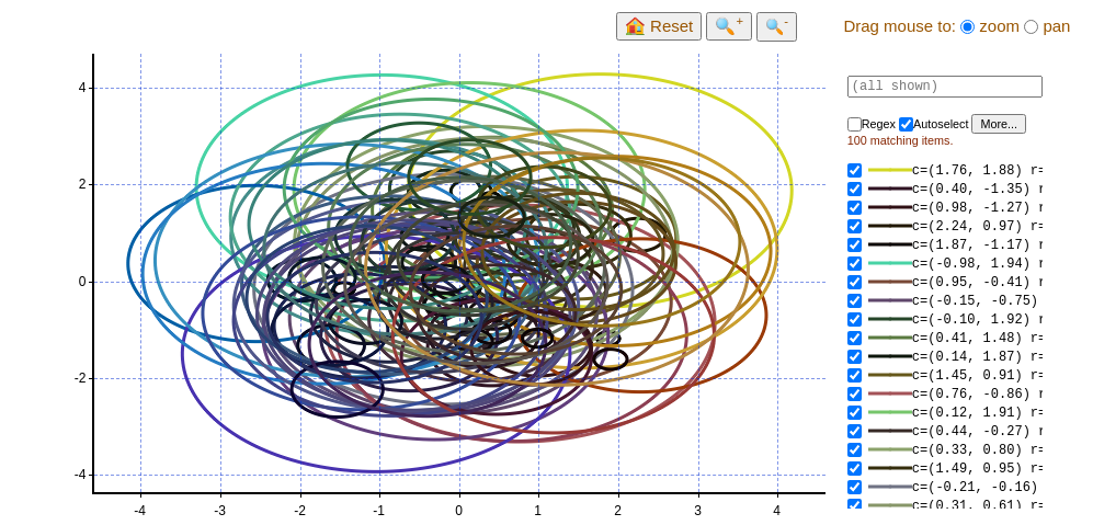
(Sorry, fixed aspect ratio is not supported yet, so the “circles” appear squashed.)
Scatter plot
Even though croquis doesn’t have the concept of a “scatter plot” per se, we can generate one by giving it “lines” that are made of single points. Here’s an example of a Gaussian distribution:
N = 1000000
X = np.random.normal(size=(N, 1))
Y = np.random.normal(size=(N, 1))
labels=['pt %d' % i for i in range(N)]

fig = croquis.plot()
fig.add(X, Y, marker_size=3, labels=labels)
fig.show()

Reading data from CSV
Here’s an example of reading a simple CSV file using pandas. The
example CSV file contains three columns: x, y1,
and y2:
import pandas as pd

df = pd.read_csv('ex5.csv')

fig = croquis.plot()
fig.add(df.x, df.y1, label='y1', line_width=0, marker_size=15)
fig.add(df.x, df.y2, label='y2', line_width=3, marker_size=10)
fig.show()
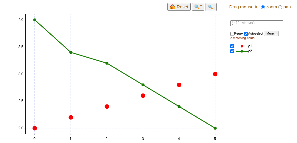
As shown here, you can change line style (in a very limited way) by using
line_width, marker_size, or highlight_line_width parameters. (The
last one specifies width of the line when highlighted by mouse hovering.)
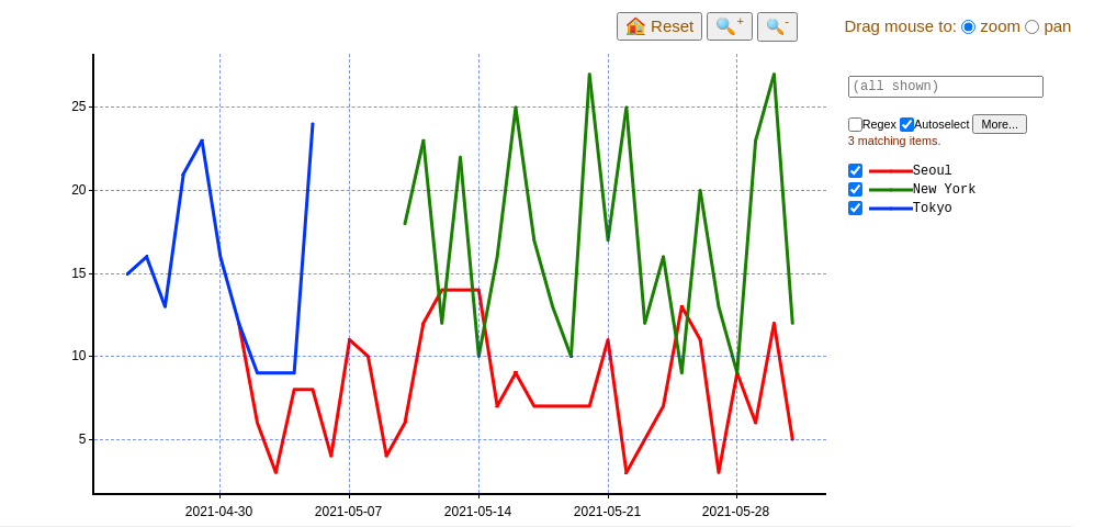
Reading data from CSV, irregular shape, with timestamps
Sometimes your data contains multiple lines with different lengths. For example, imagine your CSV file contains the following:
date |
location |
sales |
|---|---|---|
2021-05-01 |
Seoul |
12 |
2021-05-02 |
Seoul |
6 |
… |
… |
… |
2021-05-31 |
Seoul |
5 |
2021-05-10 |
New York |
18 |
2021-05-11 |
New York |
23 |
… |
… |
… |
2021-05-31 |
New York |
12 |
2021-04-25 |
Tokyo |
15 |
2021-04-26 |
Tokyo |
16 |
… |
… |
… |
2021-05-05 |
Tokyo |
24 |
Of course, you can read this data, iterate over unique values of location,
and add lines one by one. However, croquis also supports plotting multiple
lines with groupby option:
df = pd.read_csv('ex6.csv')

fig = croquis.plot(x_axis='timestamp')
fig.add(pd.to_datetime(df.date), df.sales, groupby=df.location)
fig.show()
Here, we also use pandas to transform date strings to datetime values. In order
to show dates, you have to create the plot object with x_axis='timestamp' -
x coordinates can be given as either np.datetime64 type or plain numbers (in
which case it is interpreted as
POSIX timestamps.
In case the data is really big, there’s also a more efficient method, provided
that the points are already arranged so that points that belong to the same line
appear in a consecutive chunk: you can supply another argument start_idxs,
which is the index inside X and Y where each new line starts. See the comments
on start_idxs in the XXX reference XXX for details.
Creating start_idxs from CSV data needs a bit of fiddling:
df = pd.read_csv('ex6.csv')

# If necessary, sort data so that each location appears contiguously.
df = df.sort_values(['location', 'date'])

# Create start_idxs.
locations, counts = np.unique(df.location.to_numpy(), return_counts=True)
start_idxs = np.zeros_like(counts)
start_idxs[1:] = np.cumsum(counts)[:-1]

# Here, start_idxs = [0, 22, 53]:
#   df[0:22] is the first line (New York)
#   df[22:53] is the second line (Seoul)
#   df[53:] is the third line (Tokyo)

fig = croquis.plot(x_axis='timestamp')
fig.add(pd.to_datetime(df.date), df.sales, start_idxs=start_idxs,
        labels=locations)
fig.show()
The search box
The right-hand side contains a search box: “Regex” enables regular expression. By default, “Autoselect” is on, which means what appears on the graph is exactly what matches your search expression (or everything, if the search box is empty).
When “Autoselect” is off, the selection is independent from search results: you can search and click on individual items to turn them on/off.